Brief / Idea:
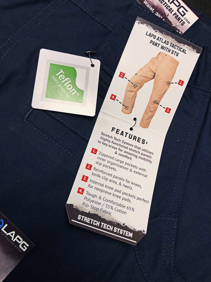
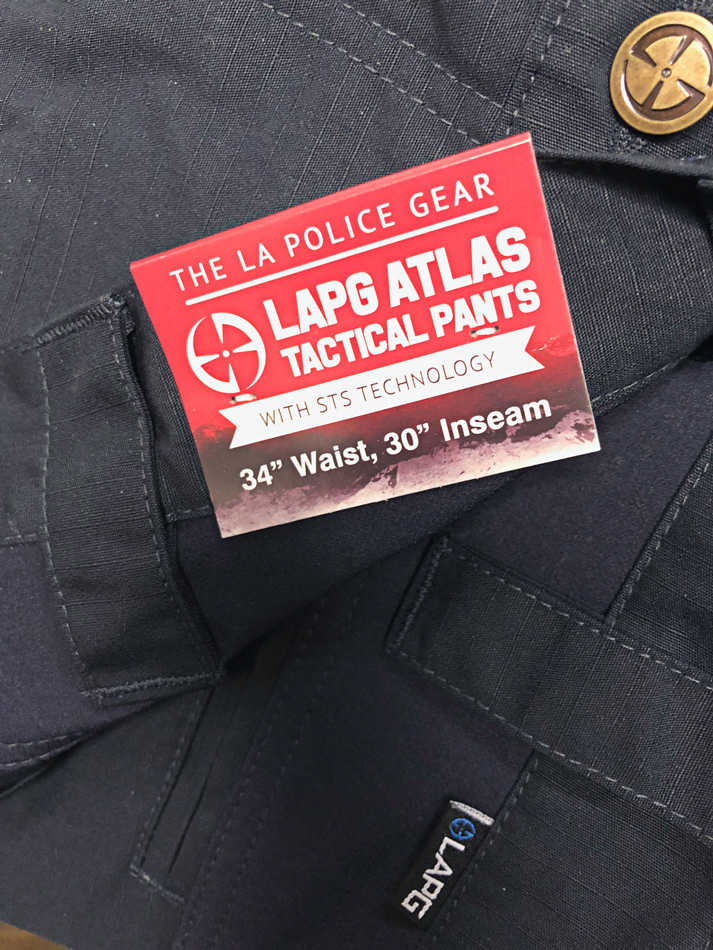
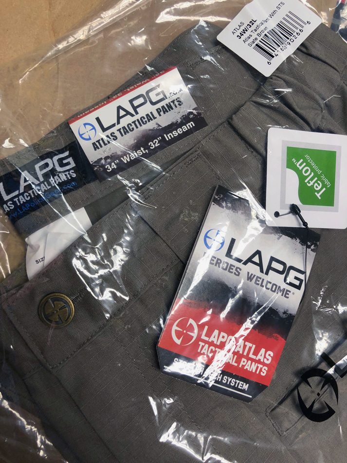
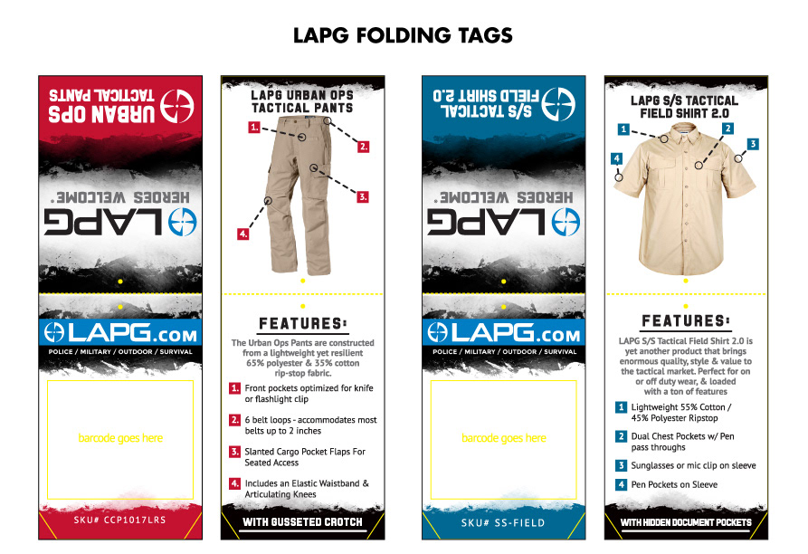
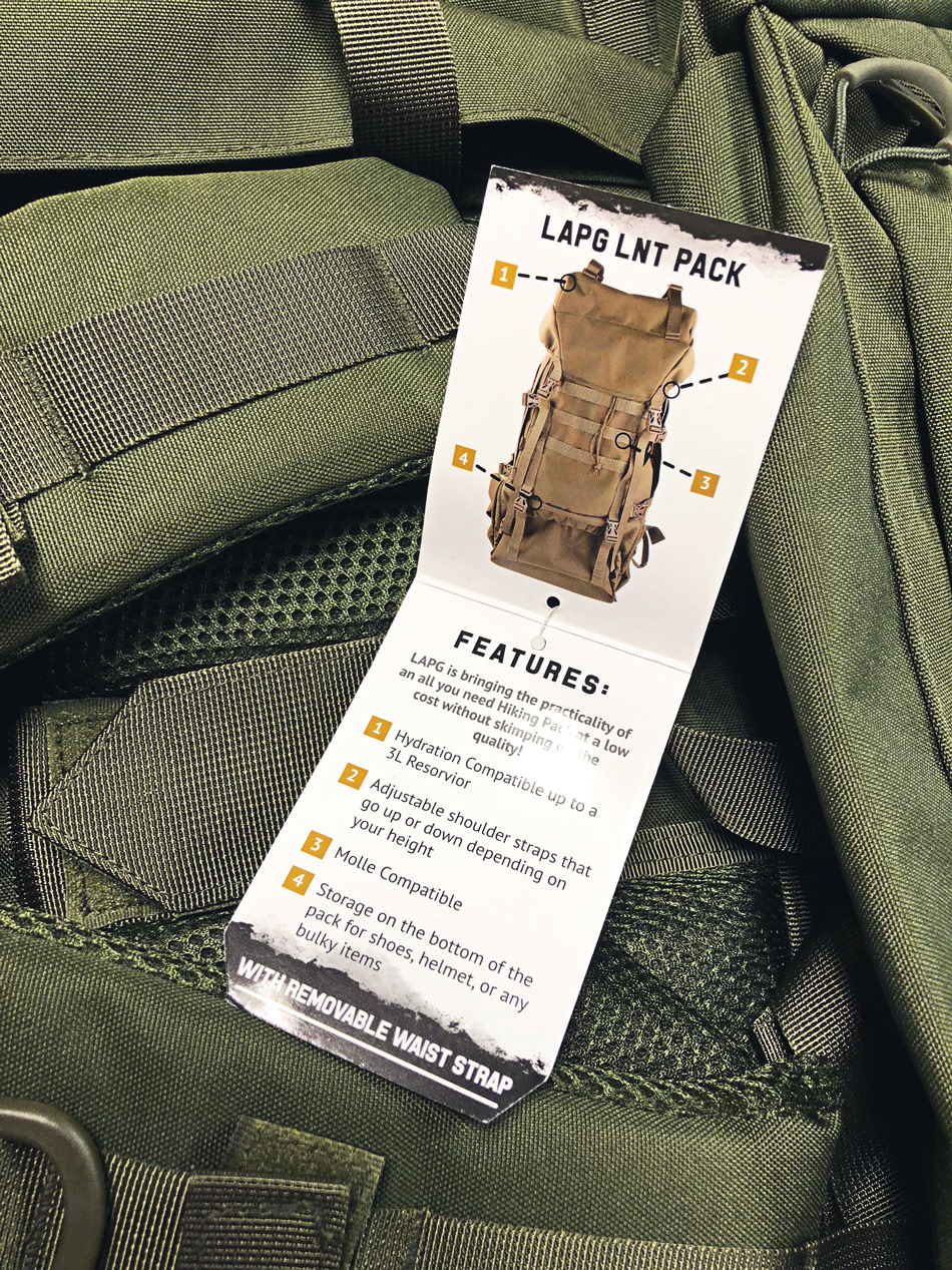
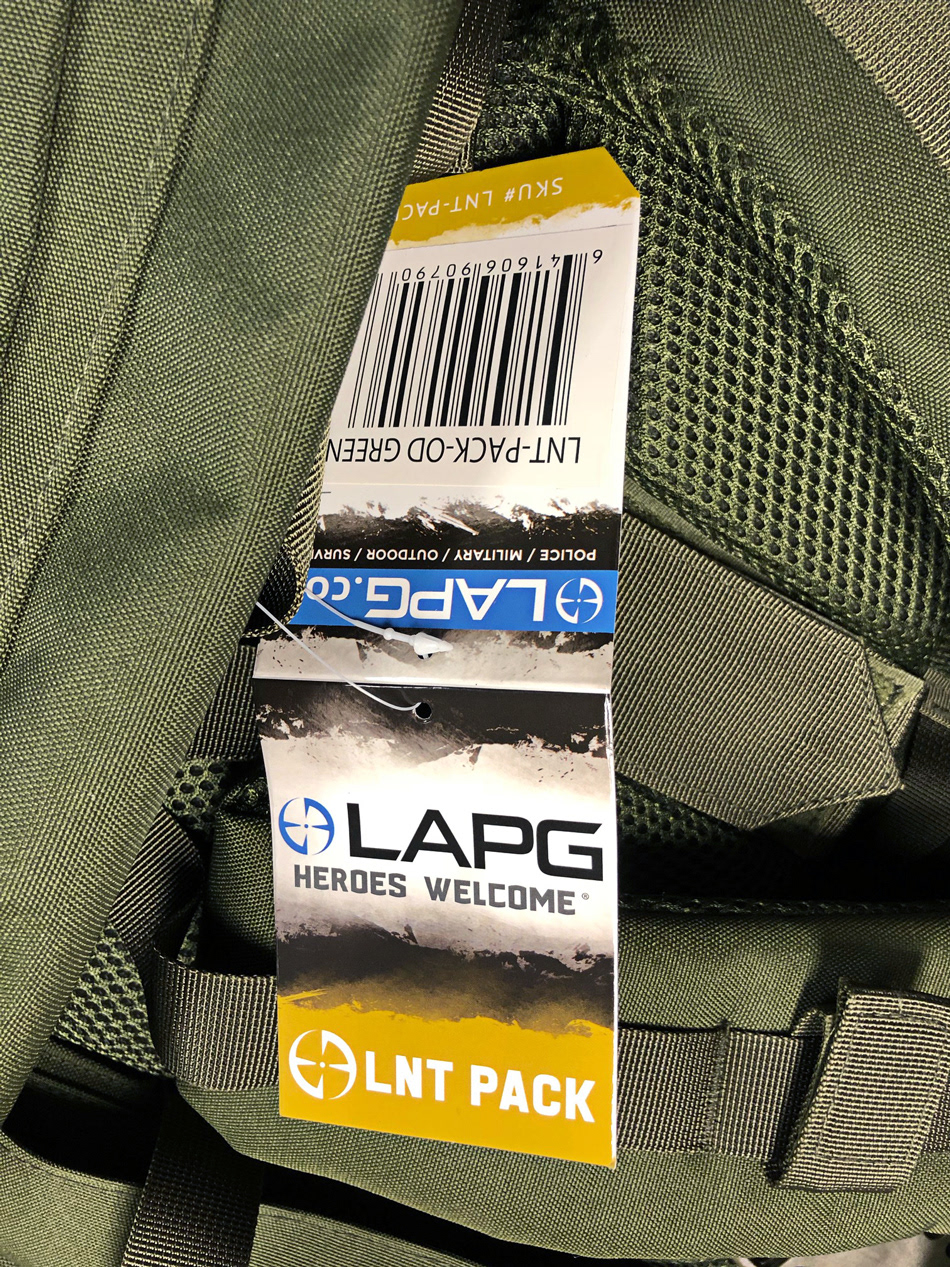
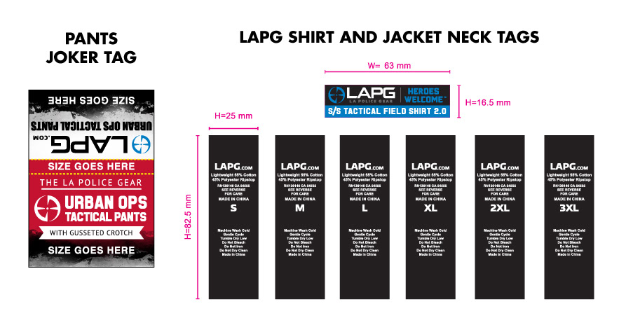
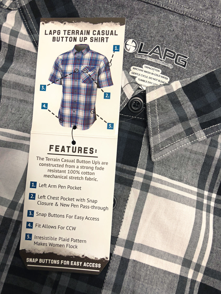
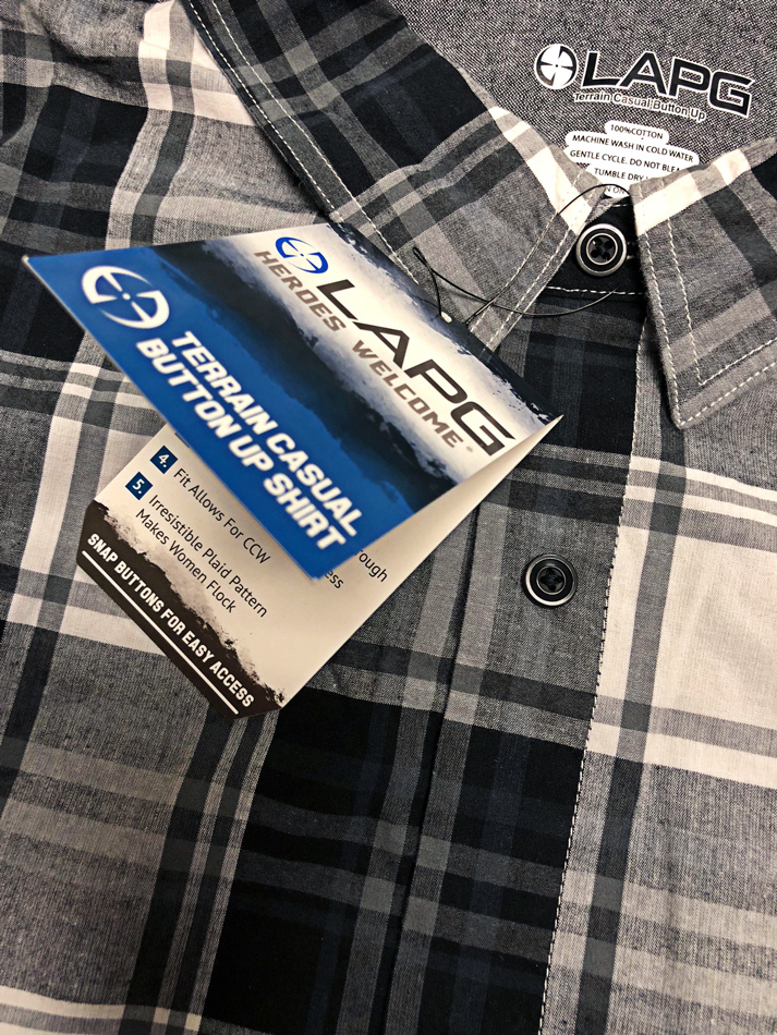
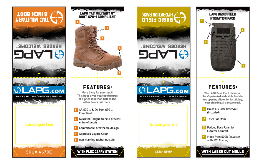
Tasked with designing a complete line up of tags for the LAPG brand product line. The requirements asked for using an aesthetic of earthly grunge that matched with the brand ethos exploring, hiking, and the outdoors. Along with introducing a color coded tag system in which the customer could use to decipher variation in the product line. An example of the color coded system was that all pants were highlighted in red all shirts tags would be noted in the LAPG logo blue, footwear in orange, women's gear in pink, and so on.
Concepts:
A large number of hand drawn mock-up were created to express the different options of folding mechanics for the hang tags. It was decided that we would use a rectangle center folded tag which would include a point punch out at the top for attachment to said garments and items. While it was discussed using mechanical stroke line drawings for early tag designs we settled on actual product photography used on each tag to visually highlight the best features from each item.
Completion:
The finalized die cut edge of the hang tags added subtle dynamic quality to the finished product that the earlier mock ups had been missing. Displayed in the retail stores the color coded hang tag system stood out from across the room helping clients visually identify product types.
Results:
Created a higher educated customer base who received updated product information via the features section on our LAPG branded products. Giving the brand smarter happier customers who valued all the intricate aspects noted for each garment and item.